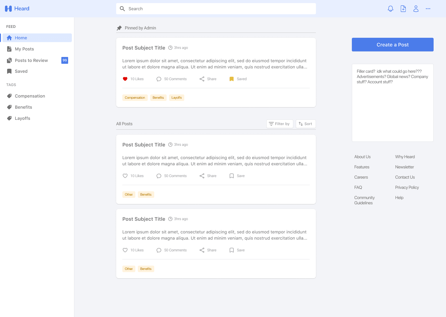
Traditional employee feedback methods are structured around set frequencies and are seen as reactive. More often than not, these methods are limited by time constraints, outdated information or practices, and improper questionnaires.
There is a need for continuous bilateral communication between employees and management to make the process more actionable.
Heard provides a safe and truly anonymous space for employees to share their thoughts and concerns with management. By allowing management access to a constant stream of insights from employees, we enable informed decision-making and continuous improvement in the workplace.
Dashboard - Authenticated employee
Create a Post
Admin - Review post
View post details

Steven Zhao
(Co-Founder, CTO)

Ethan Tam
(Co-Founder, CEO)

Patricia Tse
(Founding Designer)
As the founding designer, I spearheaded the creative direction of this early-stage startup: I created and maintained the branding, visual design, logo, and design system from scratch.
I collaborated with the co-founders/engineers to determine the scope and priority of features required for launch. After gathering the requirements, I designed the responsive UI for the dashboard and other key screens in both authenticated and unauthenticated views. I then prototyped a walkthrough demo for the application to YCombinator, a startup accelerator).
Before diving deep into design, we wanted to research the state of the current employee feedback space as well as identify common themes or pain points. We found that organizations that listen to and act on employee feedback are three times more likely to meet their financial targets, and that most employees actually feel unheard in the workplace.
To set the stage for Heard, I explored current services that offer some form of employee feedback to better understand the value they provide as well as areas that customers thought were lacking.
I then identified several key features from these feedback services and compared them against each other on those metrics to find areas of improvement.
Competitive analysis
Prior to design work, I wanted to set the foundation for each screen and key flow by modeling the Information Architecture. The IA will aid me in designing the screen layouts as I can organize the content and assemble the hierarchy of each page. Below is an example of an IA for our first iteration of the product.
First iteration of the information architecture
Wireframes
I created greyscale wireframes to explore the layout of content on eachkey page and to get a feel for the core designs without committing to a brand style, color, and imagery. The digital wireframes made it easy to adjust and edit components on the page until I found a layout that I was happy with.
Dashboard v1: 'Create a Post' text field at the top of the page
Dashboard v2: 'Create a Post' CTA - right column
Branding & Color
I gathered inspiration for the branding, logo, and style guide. We had already decided on the name "Heard" prior to this phase, thus I wanted to create something that could be easily recognizable and represents the name and purpose of Heard. Feeling inspired, I created a few iterations of possible designs for the logo, as well as different color options.
Logo inspiration
Logo Color injection
Using the main blue from the logo, I began injecting color to the key dashboard page and explored different combinations. I experimented using the blue as a contrast color, primary color, and emphasis color.
Color exploration
Color exploration
Color exploration
During this process, we went back and forth on the layout of the page as we found that the blue along with other shades can be used to emphasize certain actions or features. This lead to a few revisions and new iterations of the main dashboard, including a full side nav, search bar placement and more.
Color exploration v2
Color exploration v2
Color exploration v2
Once I finalized the color scheme and layout for the main dashboard, I then applied the same colouring to the other key pages and landed on our MVP designs
Dashboard - authenticated
View post - unauthenticated
Create a post
Admin - review posts


